|
|
||
The best tool the digital photographer has for evaluating exposure is the histogram, but there are a few issues with histogram displays that one must be aware of in order to properly interpret them to determine ideal exposure. Camera histograms are always based on the camera’s JPEG conversion settings, even if you are shooting RAW. This means that there are differences between the camera histogram and the underlying RAW data that must be understood properly before ideal exposure can be consistently achieved.
A histogram is a bar chart that shows you whether a photographs exposure is good or bad. It is a visual representation of the light and dark elements in your photograph. It helps you instantly determine whether your photos are being correctly exposed.
In other words: It’s a graph of the distribution of brightness values of individual pixels in a digital image. The left side of the histogram indicates black, or the minimum brightness level possible in the image, and the right side of the histogram is white, or the maximum brightness level possible in the image. The vertical height of the lines indicates the relative number of pixels at each brightness level between white and black.
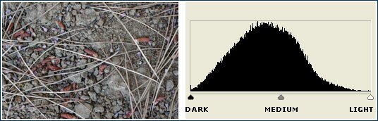
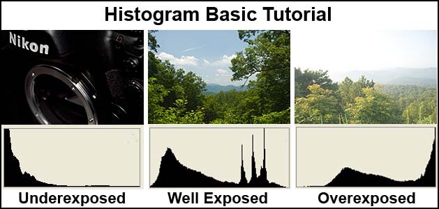
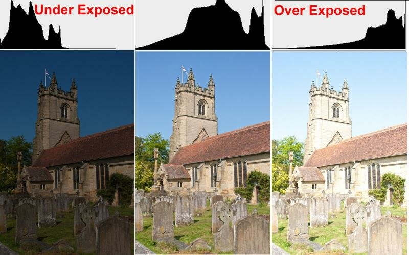
This first example shows you an image that is correctly exposed. Note that there is not a lot of contrast in the photo - we’ll talk more about high-contrast images in just a moment. Since the image is correctly exposed, the matching histogram is a bell curve, with the peak right in the middle.
Histogram correctly exposed
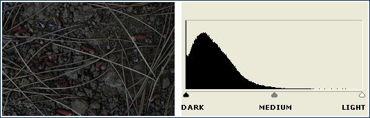
In the second example, we have the same subject and the same light, but in this case I’ve intentionally under-exposed the image. Now you can see that the peak of the histogram has shifted to the left, toward the dark side of the scale.
Histogram under exposed
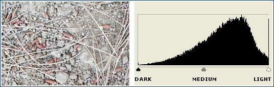
In this final example, I’ve intentionally over-exposed. Now the peak has shifted to the right, toward the light side of the scale.
Histogram Over exposed
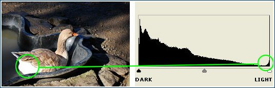
This first example shows a scene with strong contrast and very dark shadows. In this case, the shadows are SO dark that there is no detail in them - they appear as pure black. You can see this on the histogram because the peak on the far left (green circle) is cut off on the left side of the chart.
Histogram peak on the far left
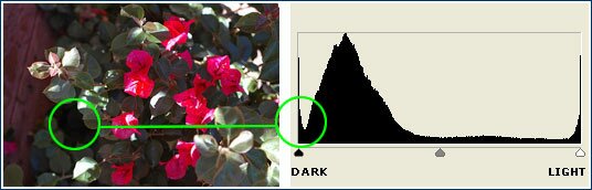
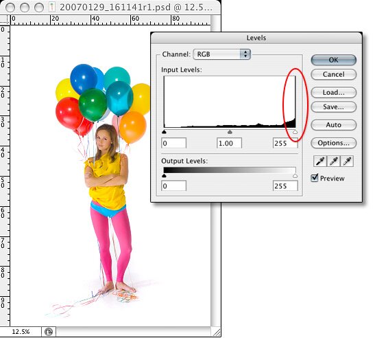
Here’s another scene with strong contrast, except this time the loss of detail is in the highlights. They appear in the photo as pure white, which is also called "blown out" highlights. You can see this represented in the histogram because the peak on the far left (green circle) is cut off on the right side of the chart.
Histogram peak on the far right
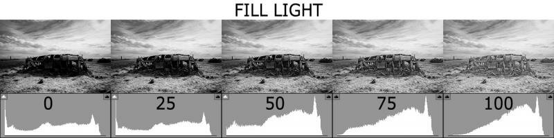
More Histogram examples

Histogram Fill Light
A histogram is a bar chart that shows you whether a photographs exposure is good or bad. It is a visual representation of the light and dark elements in your photograph. It helps you instantly determine whether your photos are being correctly exposed.
In other words: It’s a graph of the distribution of brightness values of individual pixels in a digital image. The left side of the histogram indicates black, or the minimum brightness level possible in the image, and the right side of the histogram is white, or the maximum brightness level possible in the image. The vertical height of the lines indicates the relative number of pixels at each brightness level between white and black.
This first example shows you an image that is correctly exposed. Note that there is not a lot of contrast in the photo - we’ll talk more about high-contrast images in just a moment. Since the image is correctly exposed, the matching histogram is a bell curve, with the peak right in the middle.
Histogram correctly exposed
Histogram under exposed
Anuncios Google
Histogram Over exposed
This first example shows a scene with strong contrast and very dark shadows. In this case, the shadows are SO dark that there is no detail in them - they appear as pure black. You can see this on the histogram because the peak on the far left (green circle) is cut off on the left side of the chart.
Histogram peak on the far left
Histogram peak on the far right
More Histogram examples
Histogram Fill Light


